Product experience case study
1. Interactive Prototypes
Promotional Website
Mobile App Prototype
2. Design Approach
UI Design & User Experience
I handled the entire UI design in Figma, including screens for managing household members, monitoring device activity, viewing summaries, and browsing detailed room views. I made use of variables, components, and prototyping to create a cohesive experience. The project emphasized consistency, scalability, and a user-first approach to smart home design.
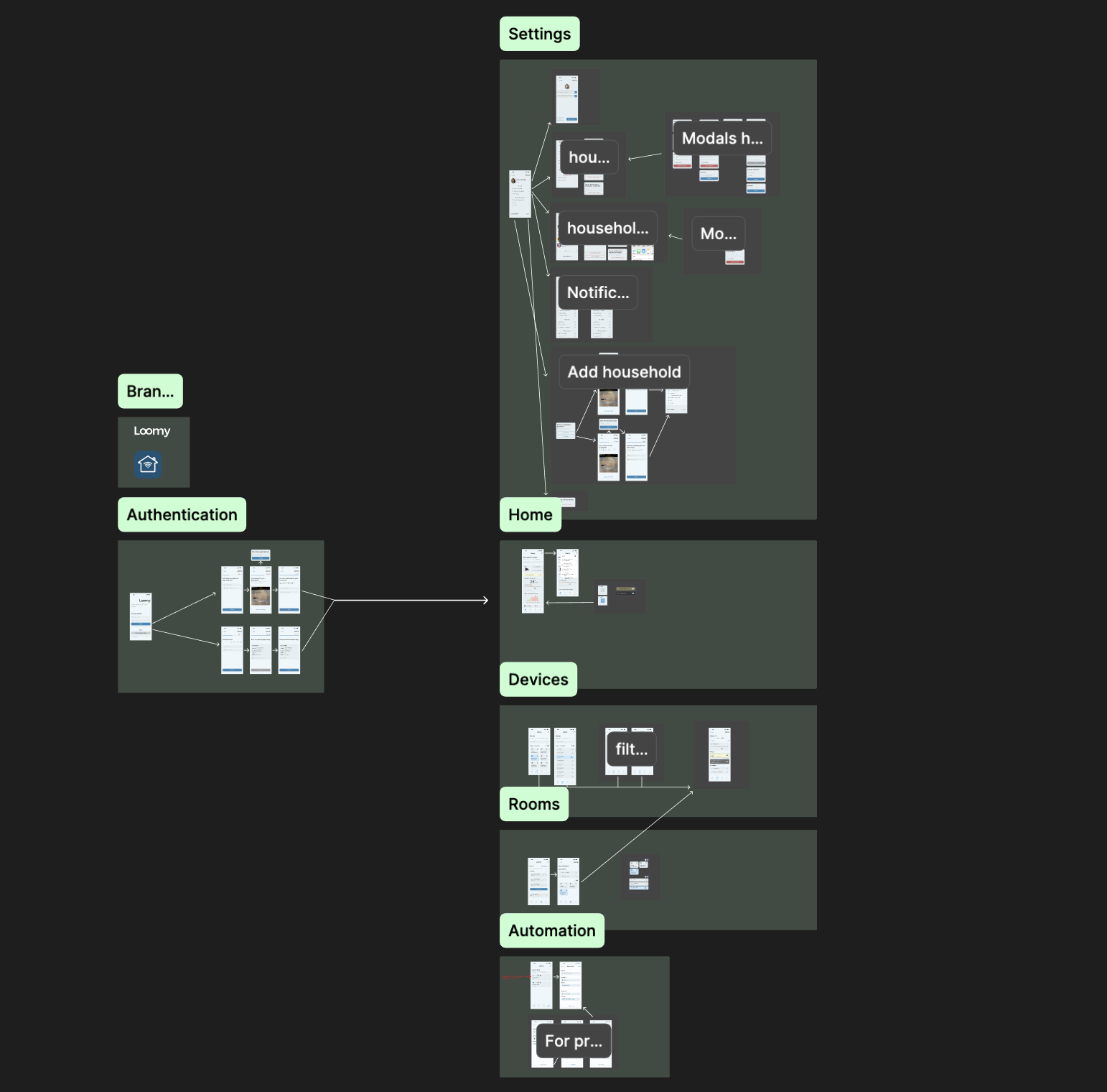
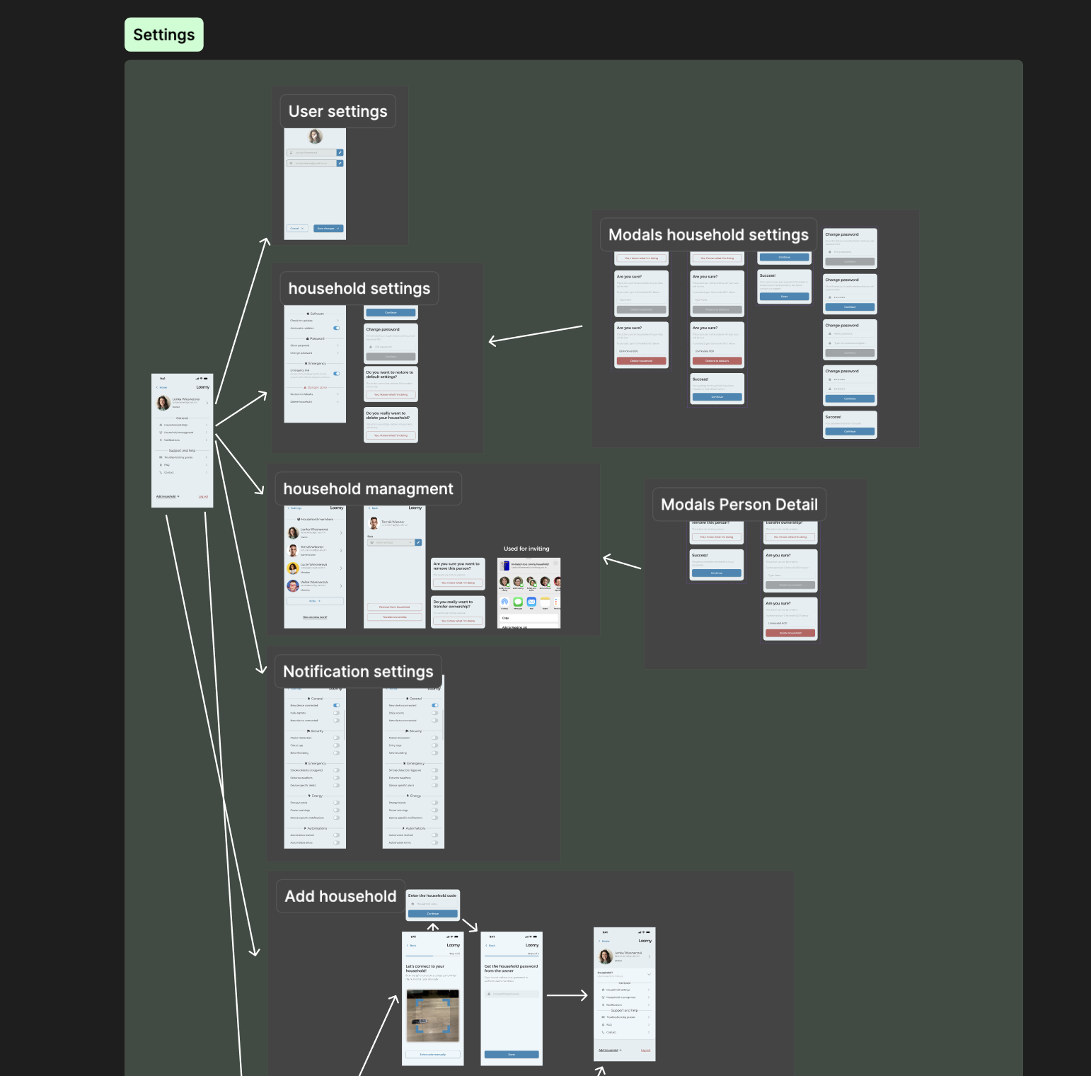
Design file examples
Design system case study
1. Design System
Structure & Consistency
A key focus was applying Design System principles throughout the project. As shown in the design files below, I structured the interface with a comprehensive component library, consistent use of design tokens, and clear naming conventions. This approach made it easy to navigate the designs to make necessary adjustments. The design system ensures consistency, scalability, and could be easily maintained and extended in the future.
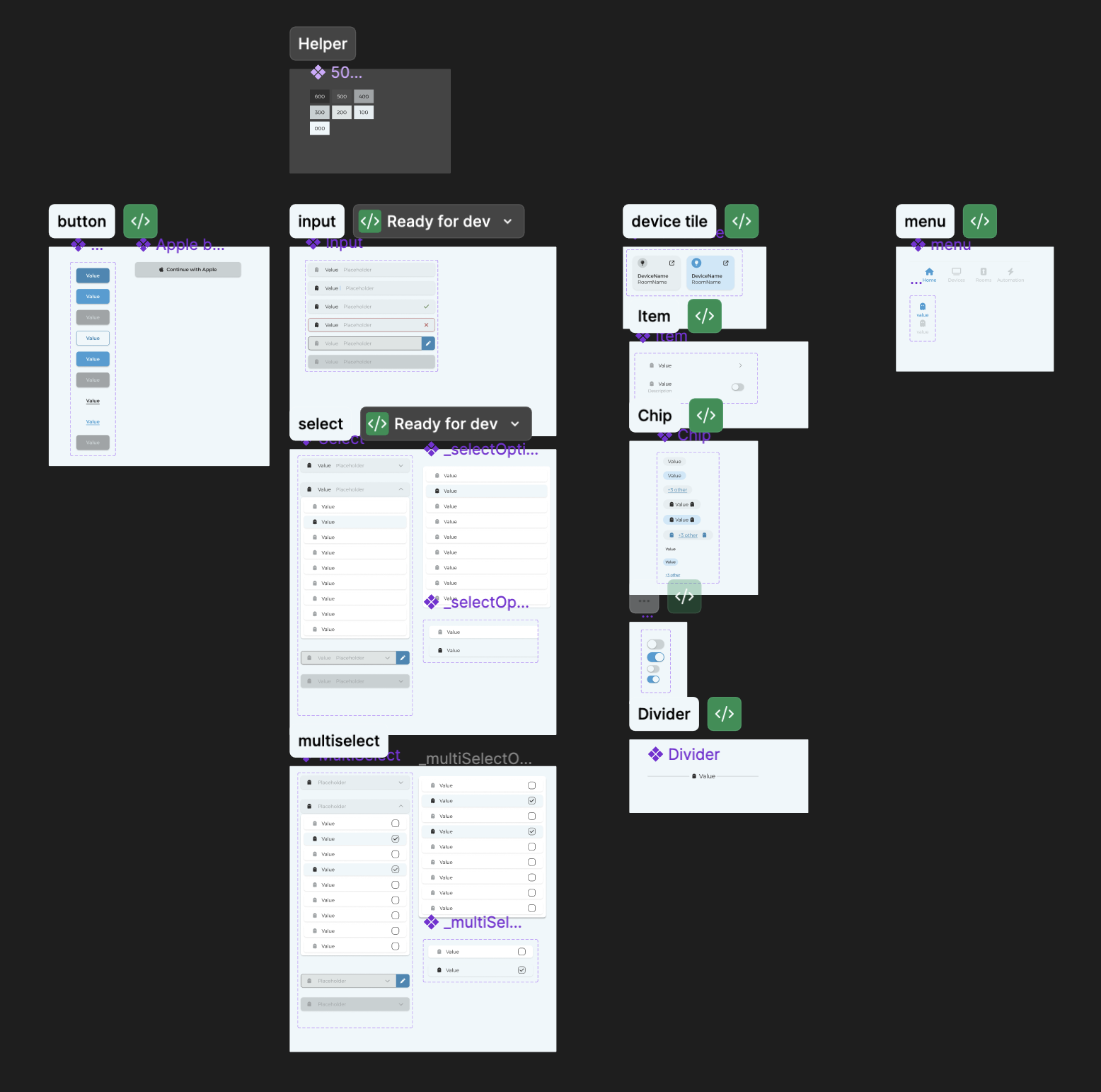
The design system file
2. Variables & Theming
The design system leveraged Figma's variables feature to establish a robust foundation for consistency. I created two layers of variables: core variables that defined the fundamental design tokens (like colors, spacing, and typography), and semantic variables that mapped these core tokens to specific UI contexts. For example, core variables included primary colors and base spacing units, while semantic variables assigned these to roles like "button-background" or "text-secondary". This two-tier approach made it incredibly simple to adjust the entire design system—changing a single core variable would automatically propagate across all dependent components and screens, ensuring consistency throughout the project while allowing for easy theming and future iterations.
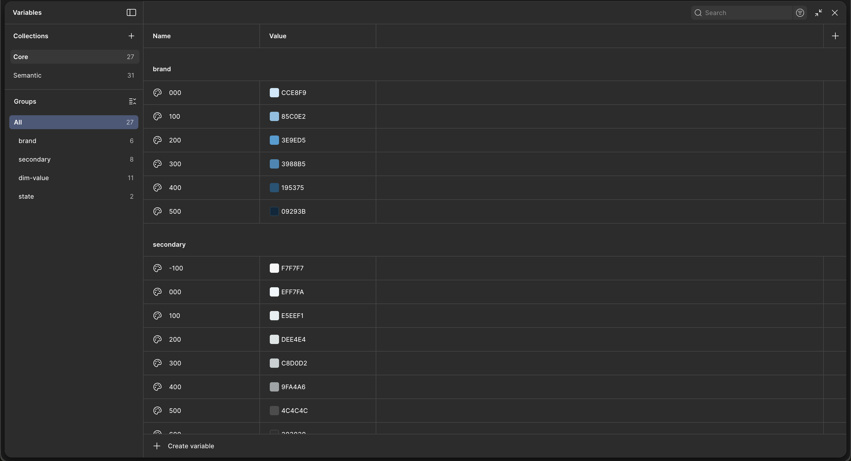
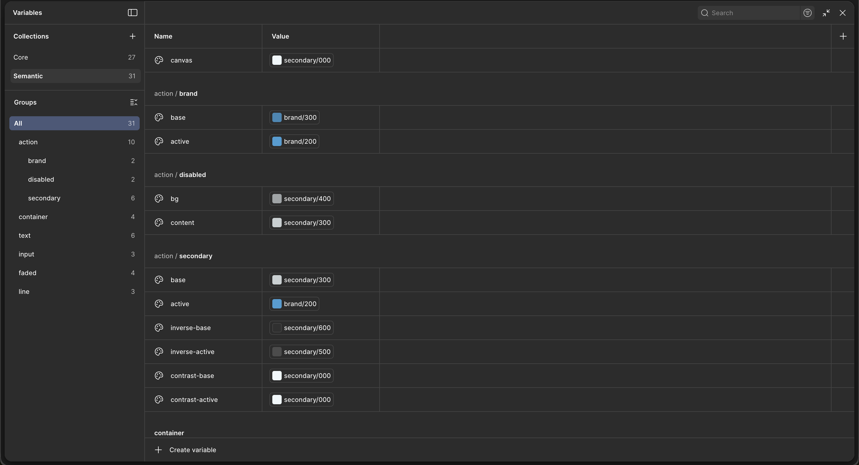
Variables in Figma
3. Practical Application
To demonstrate the power of this variable system, the button component serves as a perfect example. As shown in the design panel, the button uses semantic variables like "action/brand/base" for the fill color and "text/inverse" for text color. Each button variant automatically inherits the correct styling from these semantic tokens. This meant that updating a single core variable would instantly reflect across all button states and variants throughout the entire design system, significantly reducing maintenance overhead and ensuring visual consistency.
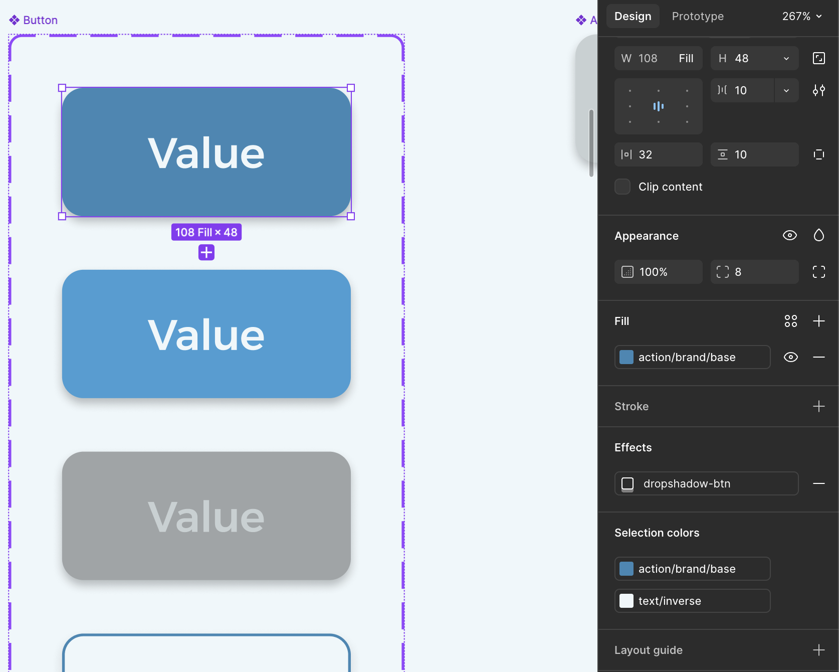
Button component using semantic variables in Figma